
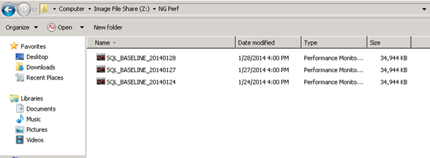
I’m not a big fan of Performance Monitor but in this post we will review the steps in how to export the results so they can be read more easily in Excel. This post will not discuss how to setup a data collector set and will assume the reader already has results saved to the file system in a .blg file format.
If you’ve ever used PerfMon you’ve probably noticed .blg files. These are the files that hold all of our performance data that we have collected over the past week. When you open this file in PerfMon it can be tedious work to get the data in a presentable form. Actually, I don’t know if there’s a good way to get this data in a presentable form using the PerfMon’s GUI.
First thing we need to do is to convert the .blg to .csv so we can open it in Excel. To convert this file open command prompt and navigate to the directory the file is located and type:
Relog SQL_BASELINE_20140128.blg –f CSV –o NewFile.csv
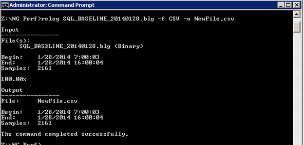
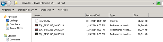
Once the command completes successfully, you should see the new file in the same directory:
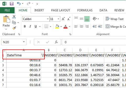
Open NewFile.csv in Excel:
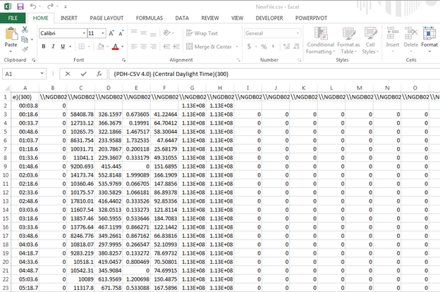
Not pretty huh? First thing we need to do is format the first column….which is the Date column. Change the text in the A1 cell from PDH-CSV 4.0…. to DateTime:
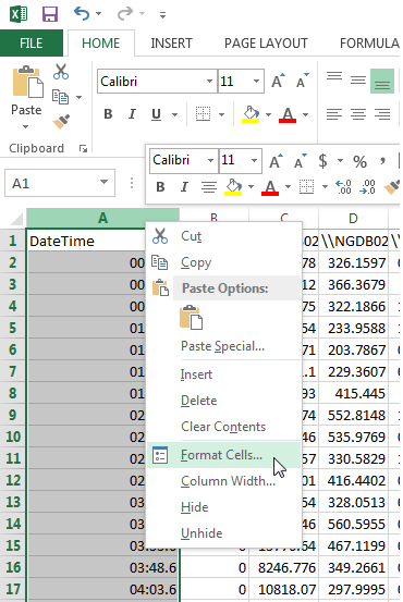
Next, remove Row 2. We do not need this data. Also, highlight column A and right click anywhere in the column and choose Format Cells:
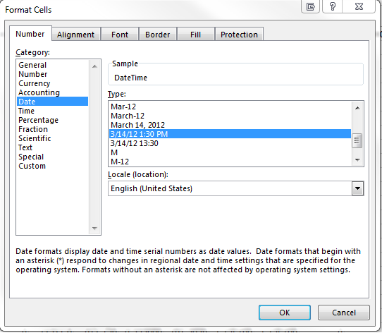
On the number tab, click the Data Category and select 3/14/2012 1:30PM:
Press Ctrl+Home to select the A1 cell.
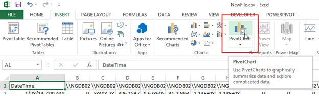
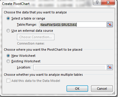
Create Pivot Chart
Click on the Insert tab and select Pivot Chart:
The Pivot Chart dialog box should automatically select the correct cells to analyze. If not, make sure all of the cells are selected:
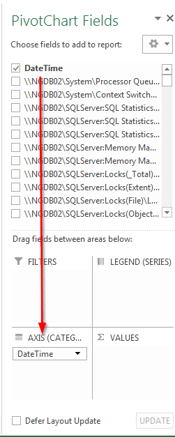
Once the new worksheet opens, drag DateTime to the Axis Fields pane:
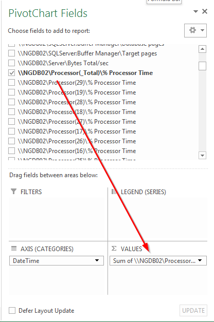
Now, depending on what counter(s) you want to analyze, drag it down to the Values pane. For this example, I’ll analyze Processor(_Total)\% Processor Time:
Ta da! You now have a graph that displays your Processor %.
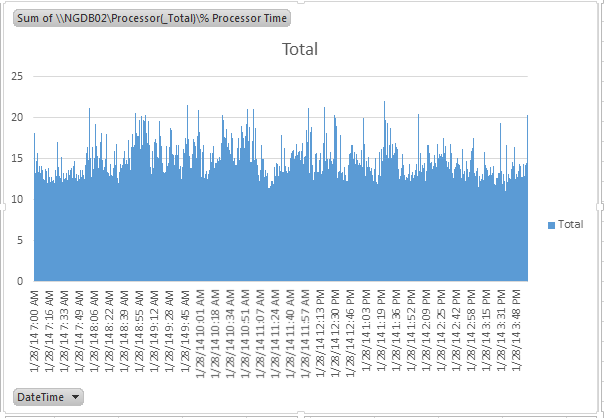
To make this presentable, simply format the graph to your liking and you’re done.